Nested components stacked inside each other, like bold and code inside links and tables inside lists, to find where the styles break.
Most cases are real markdown through the same renderer as notes and posts, so they show what a page would. The rest are components that markdown can't produce. Each has a line on what to look for.
Typography inside a blockquote
Headings, lists and a rule inside a quote: spacing between blocks, the quote's italics reaching things that shouldn't be italic, the left rule's height.
A heading inside a quote
Paragraph with bold, italic, strike, inline code, and a link.
A smaller heading
A second paragraph straight after it.
a list
inside the quote
nested one level
an ordered list
also inside
The smallest heading
Last line of the quote.
Code blocks inside a blockquote
A code block in a quote: its width against the quote's padding, whether the text goes italic, the gap before and after it.
Before the code.
ts
const message = "a code block inside a blockquote";console.log(message);
After the code.
text
a block with no language
Blockquotes three deep
Rules stacking up on the left, indent adding up, a code block at the bottom, the paragraph that follows each level.
Level 1 paragraph.
Level 2 paragraph.
Level 3 paragraph with inline code.
sh
echo "three quotes deep"
Back at level 2.
Back at level 1.
A table inside a blockquote
Does the table scroll or overflow the quote, and does it inherit the quote's italics?
Column A
Column B
Column C
plain
code
bold
a longer cell that has to wrap onto another line inside the quote
2
3
Nested and loose lists
Four levels of nesting, paragraphs in a list item, a code block, a quote and a table inside items: indents, markers and gaps.
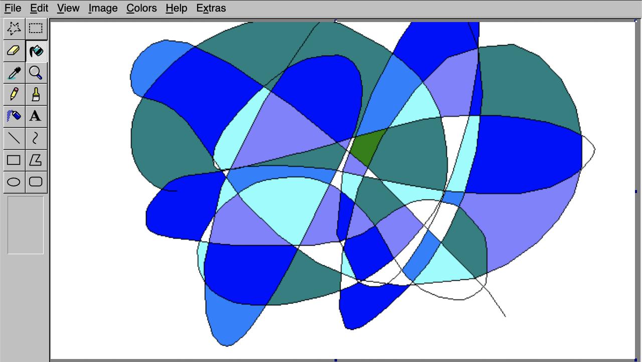
A pixelated drawing in a quote, a list item and a link: does it stay inside its container and keep its aspect ratio?
A paragraph, then an image:
A quote with an image:
A list item with an image:
Horizontal rules
A rule between paragraphs, after a list, and inside a quote: spacing above and below.
A paragraph before a rule.
A paragraph after it.
a list
then a rule
A quote
with a rule inside it
Code blocks, awkwardly
Back-to-back blocks, none, an empty one, a very long line, 60 lines, and a few languages: gaps, scrolling, heights.
Two blocks back to back:
ts
const first = 1;
ts
const second = 2;
A block with no language, an empty one, and a one-line one:
text
no language here
ts
json
{ "single": "line" }
One very long line:
ts
const long = "xxxxxxxxxxxxxxxxxxxxxxxxxxxxxxxxxxxxxxxxxxxxxxxxxxxxxxxxxxxxxxxxxxxxxxxxxxxxxxxxxxxxxxxxxxxxxxxxxxxxxxxxxxxxxxxxxxxxxxxxxxxxxxxxxxxxxxxxxxxxxxxxxxxxxxxxxxxxxxxxxxxxxxxxxxxxxxxxxxxxxxxxxxxxxxxxxxxxxxxxxxxxxxxxxxxxxxxxxxxx";
Many lines:
ts
const line1 = 1; // line 1const line2 = 2; // line 2const line3 = 3; // line 3const line4 = 4; // line 4const line5 = 5; // line 5const line6 = 6; // line 6const line7 = 7; // line 7const line8 = 8; // line 8const line9 = 9; // line 9const line10 = 10; // line 10const line11 = 11; // line 11const line12 = 12; // line 12const line13 = 13; // line 13const line14 = 14; // line 14const line15 = 15; // line 15const line16 = 16; // line 16const line17 = 17; // line 17const line18 = 18; // line 18const line19 = 19; // line 19const line20 = 20; // line 20const line21 = 21; // line 21const line22 = 22; // line 22const line23 = 23; // line 23const line24 = 24; // line 24const line25 = 25; // line 25const line26 = 26; // line 26const line27 = 27; // line 27const line28 = 28; // line 28const line29 = 29; // line 29const line30 = 30; // line 30const line31 = 31; // line 31const line32 = 32; // line 32const line33 = 33; // line 33const line34 = 34; // line 34const line35 = 35; // line 35const line36 = 36; // line 36const line37 = 37; // line 37const line38 = 38; // line 38const line39 = 39; // line 39const line40 = 40; // line 40const line41 = 41; // line 41const line42 = 42; // line 42const line43 = 43; // line 43const line44 = 44; // line 44const line45 = 45; // line 45const line46 = 46; // line 46const line47 = 47; // line 47const line48 = 48; // line 48const line49 = 49; // line 49const line50 = 50; // line 50const line51 = 51; // line 51const line52 = 52; // line 52const line53 = 53; // line 53const line54 = 54; // line 54const line55 = 55; // line 55const line56 = 56; // line 56const line57 = 57; // line 57const line58 = 58; // line 58const line59 = 59; // line 59const line60 = 60; // line 60
Other languages:
css
.card { border: 1px solid var(--border); }
diff
- const old = 1;+ const next = 2;
tsx
export const X = () => <div className="x">hi</div>;
Every text component in one quote
The typography components that markdown can't produce, together inside a blockquote: Lead, Muted, CapsLabel, Small, Highlight, Underline.
An H3 in a quote
A lead paragraph, muted and body size.
A paragraph with bold, italic, underline, strike, a highlight and code.
A muted line, small.
A caps labelSmall fine print at the end.
H4
H5
H6
A multi-file code block inside a quote and a list
Tabs, the file explorer and the scroll areas inside narrower containers: do the tabs overflow, does the explorer still fit?
A multi-file code block inside a quote:
tsxsrc/app/page.tsx
export default function Page() { return <h1>Hello</h1>;}
A multi-file code block inside a list item:
tsxsrc/app/page.tsx
export default function Page() { return <h1>Hello</h1>;}
An accordion and a table inside a quote
Interactive and table components in a quote: the accordion's chevrons and hover blocks, and the table's scroll against the quote's edge.
An answer with code and more text.
Short.
Component
Inside
Table
Blockquote
Wrapping inline backgrounds
Highlight, underline and inline code that wrap across lines, which is where box decorations and padding usually break. Narrow the window.
a highlighted run of words long enough that it will have to wrap onto several lines on a phone and show how the background behaves at each break then an underlined run that is also long enough to wrap across more than one line of text then an inline code run with spaces that is long enough to wrap across more than one line as well.
Bugs found here and since fixed, each shown twice to confirm the fix. The "before" side is rebuilt with CSS that undoes the fix, since the old code is gone.
A link that is only code
Before: nothing said it was a link, and on hover the light blue code vanished into the blue block. After: it ends in a small box-and-arrow icon and turns dark on hover.
These apply only when the link's whole text is code, like useState alone. A link that mixes code with other words gets no mark. The box with an arrow leaving it (in "Other link icons") won and is now what the site uses; the rest are kept for comparison. Each option shows the link at rest, then held in its hover look.
Underline the text
A plain 1px underline under the code text, 2px below. The first version, before the icons.
At rest: call useState inside a sentence, with more text around it.
Hovered: call useState inside a sentence, with more text around it.
Thick underline
2px, a little further down. Heavier, harder to miss.
At rest: call useState inside a sentence, with more text around it.
Hovered: call useState inside a sentence, with more text around it.
Dotted underline
Softer than a solid line, and distinct from a normal underline.
At rest: call useState inside a sentence, with more text around it.
Hovered: call useState inside a sentence, with more text around it.
Dashed underline
Between dotted and solid.
At rest: call useState inside a sentence, with more text around it.
Hovered: call useState inside a sentence, with more text around it.
Line on the chip's bottom edge
A 1px line drawn along the bottom of the code background, so the chip itself looks underlined.
At rest: call useState inside a sentence, with more text around it.
Hovered: call useState inside a sentence, with more text around it.
Line just under the chip
A 1px line hugging the outside of the chip's bottom edge: lower than the others.
At rest: call useState inside a sentence, with more text around it.
Hovered: call useState inside a sentence, with more text around it.
Blue-tinted chip, no underline
The code background takes a blue tint instead of an underline.
At rest: call useState inside a sentence, with more text around it.
Hovered: call useState inside a sentence, with more text around it.
Trailing arrow, no underline
A small ↗ after the code, the same kind of cue as the arrows on your contact links.
At rest: call useState inside a sentence, with more text around it.
Hovered: call useState inside a sentence, with more text around it.
More arrow designs
Variations on the trailing arrow, which is the one to beat.
↗, spaced (the one above)
The text arrow glyph in the code's own font, a space after the code. The baseline for the rest.
At rest: call useState inside a sentence, with more text around it.
Hovered: call useState inside a sentence, with more text around it.
↗, no space
Tucked right up against the last letter.
At rest: call useState inside a sentence, with more text around it.
Hovered: call useState inside a sentence, with more text around it.
→ instead
A plain right arrow: reads as 'go to' rather than 'leaves'.
At rest: call useState inside a sentence, with more text around it.
Hovered: call useState inside a sentence, with more text around it.
↗, small and raised
Superscript-sized, like a footnote mark.
At rest: call useState inside a sentence, with more text around it.
Hovered: call useState inside a sentence, with more text around it.
↗, dimmed
The arrow at 60% strength, so the code stays the main thing.
At rest: call useState inside a sentence, with more text around it.
Hovered: call useState inside a sentence, with more text around it.
Icon arrow, up-right
A drawn arrow (Lucide's ArrowUpRight) instead of a font glyph, so it has the same weight whatever the font.
At rest: call useState inside a sentence, with more text around it.
Hovered: call useState inside a sentence, with more text around it.
Icon arrow, right
Lucide's ArrowRight, drawn the same way.
At rest: call useState inside a sentence, with more text around it.
Hovered: call useState inside a sentence, with more text around it.
↗ outside the chip
The arrow follows the chip instead of sitting inside it, still part of the link's hover block.
At rest: call useState inside a sentence, with more text around it.
Hovered: call useState inside a sentence, with more text around it.
↗ that nudges on hover
The arrow slides up and right when you really hover it. The held hover below can't show the movement, so hover the first line.
At rest: call useState inside a sentence, with more text around it.
Hovered: call useState inside a sentence, with more text around it.
Other link icons
Icons that mean "link" rather than "go", drawn as masks so they take the text colour and turn dark on hover with everything else.
Chain link, after
The classic link icon (Lucide's Link) after the code.
At rest: call useState inside a sentence, with more text around it.
Hovered: call useState inside a sentence, with more text around it.
Chain link, before
The same icon in front of the code, the way a hyperlink is often marked.
At rest: call useState inside a sentence, with more text around it.
Hovered: call useState inside a sentence, with more text around it.
Chain link, quiet
Smaller and at 60% strength, so the code stays the main thing.
At rest: call useState inside a sentence, with more text around it.
Hovered: call useState inside a sentence, with more text around it.
Single chain link
Lucide's Link2: one flat link, a cleaner shape at small sizes.
At rest: call useState inside a sentence, with more text around it.
Hovered: call useState inside a sentence, with more text around it.
Box with an arrow leaving it
The usual 'opens elsewhere' icon. It says more than an arrow, but is a heavier shape.
At rest: call useState inside a sentence, with more text around it.
Hovered: call useState inside a sentence, with more text around it.
Turning arrow
A corner arrow, like 'continue here'.
At rest: call useState inside a sentence, with more text around it.
Hovered: call useState inside a sentence, with more text around it.
Small chevron
The lightest mark: just a small › after the code.
At rest: call useState inside a sentence, with more text around it.
Hovered: call useState inside a sentence, with more text around it.
Arrow in a circle
A round 'go' button feel, still outlined.
At rest: call useState inside a sentence, with more text around it.
Hovered: call useState inside a sentence, with more text around it.
A highlight is a tinted background behind a run of text. Where it wraps onto a second line, the background either keeps its rounded ends on each line or loses them. Each design is shown in a narrow column, then in a full-width line.
Rounded, sliced (before)
The old look. The corners round only at the very start and end of the highlight, so a wrapped line ends square and the next begins square.
Narrow: a highlighted run of words long enough to wrap onto three lines and then plain text again.
Wide: some words, then a shorter highlight, then more words.
Rounded, repeated
Every line gets its own rounded ends and side padding, the way inline code does.
Narrow: a highlighted run of words long enough to wrap onto three lines and then plain text again.
Wide: some words, then a shorter highlight, then more words.
Sharp, sliced
No radius. Padding only at the very start and end.
Narrow: a highlighted run of words long enough to wrap onto three lines and then plain text again.
Wide: some words, then a shorter highlight, then more words.
Sharp, repeated (now)
No radius, with side padding on every wrapped line. Reads like a true highlighter, and is what the site uses.
Narrow: a highlighted run of words long enough to wrap onto three lines and then plain text again.
Wide: some words, then a shorter highlight, then more words.
Rounder, repeated
A larger radius on every line.
Narrow: a highlighted run of words long enough to wrap onto three lines and then plain text again.
Wide: some words, then a shorter highlight, then more words.
Sharp, no side padding
A bare band behind the text, no padding at either end.
Narrow: a highlighted run of words long enough to wrap onto three lines and then plain text again.
Wide: some words, then a shorter highlight, then more words.